Children’s Hospital, University of Heidelberg
Heidelberg, Germany
telah dilaksanakan
2008

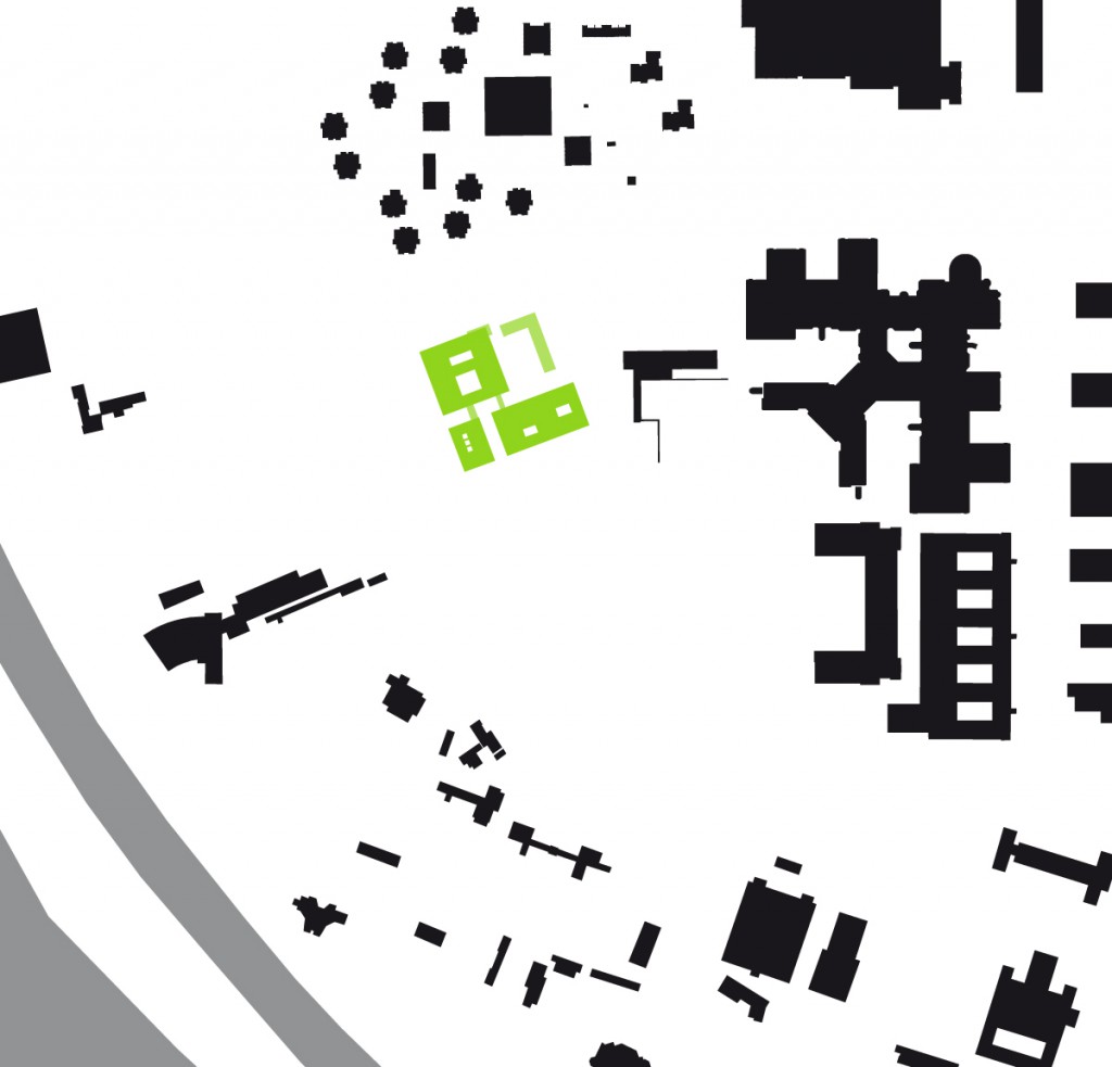
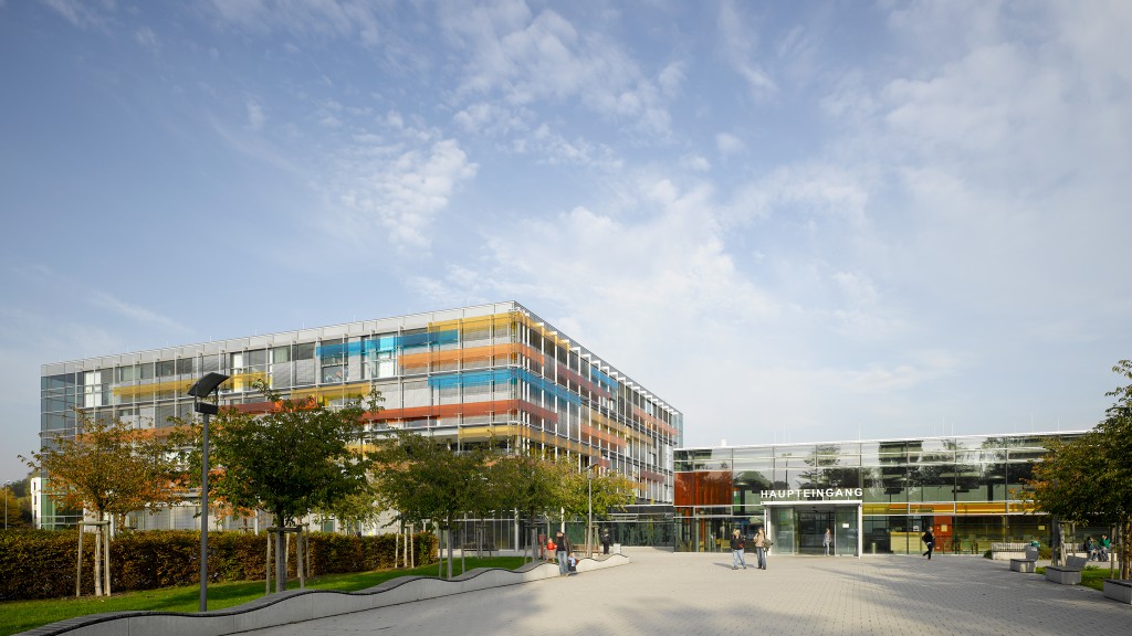
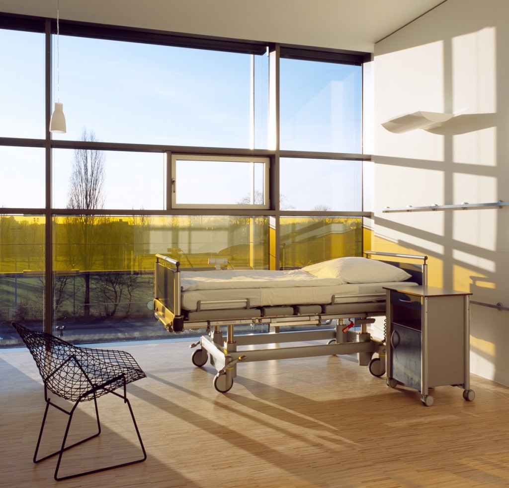
This winning entry in an international competition is inspired by the Rubik’s cube: a simple, playful form that brings order to a complex multipurpose structure, uses primary colours to help patients, visitors and staff find their way around the building, and gives each department its own space within the cube. Patients are diagnosed in the adjoining building and treated in the cube itself, with the entrance hall linking the two areas. The garden level houses the intensive care wards, and the ground floor the busier outpatient wards. The three floors above contain inpatient treatment areas with full-height windows and views of the surrounding greenery. The building’s simple, logical structure is a part of its identity, making it one of the most distinctive features of the hospital campus.
Date of completion: 2008


